Motion-designed lyric video for the "Phil of the Future" TV show theme song.
This is a make-over project based on an old project from my first year of University. I chose to makeover my typeface, called “Illuminate”, which was a hand-made light-painted typeface, created from the physical environment. An accompanying, small multi-page publication featured this typeface and my research & process. This publication drew inspiration from light. So, some pages were written with a UV pen and had to be read with a UV torch shone on it in order to reveal the hidden invisible ink elements. I bound the book myself with a stitching method and also embellished the contents page text with gold foil.
The reason I chose this project to makeover was because I liked the concept but not the execution. As I have an interest in designing for TV, and as I hadn't learnt motion design before, I decided to give this typeface new life by animating it in After Effects, allowing me to learn some new skills.
This show is about a boy, called Phil, and his family from the 22nd century who go on a time-travelling holiday and get stuck in 2005 (when the show is set). I thought this show would be good to choose as my existing typeface looked futuristic to me.

Original typeface in publication
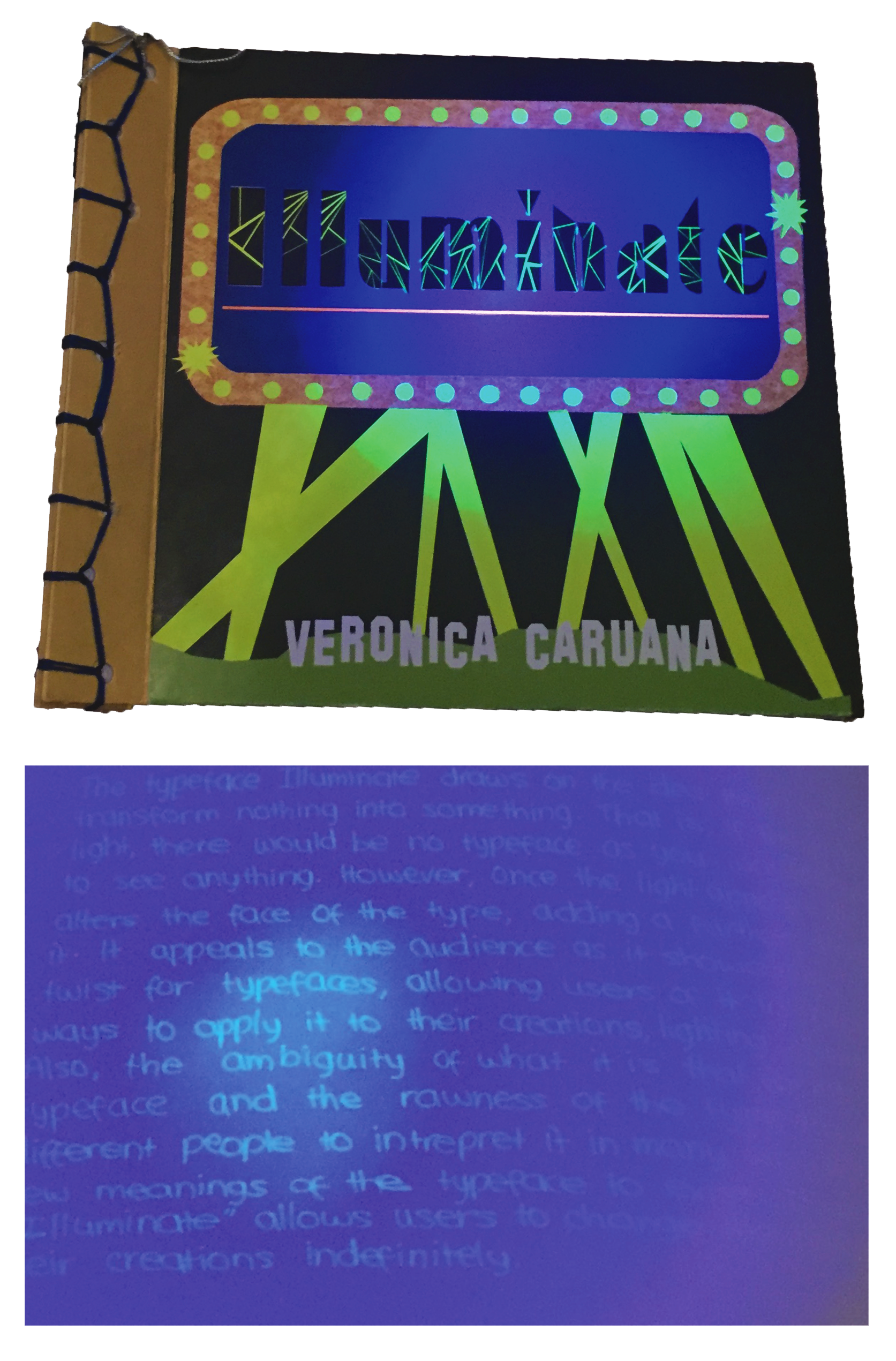
Original publication project
My first step was to edit the existing typeface’s colours to make them brighter and to remove the black backgrounds, so they can be typed on any background. I then downloaded a Photoshop extension, called “Fontself” that allows any image to be turned into a typable font. This involved me aligning each letter and the app allows you to customize the kerning and other elements that make up a font.
I made a mind map and mood board to start generating visual ideas for the lyric video. I liked kinetic typography which is what I looked at as I was developing ideas. I also watched videos regarding After Effects to start learning different tips. I initially found it hard to plan the visuals as this process of making a video was new to me and also had to make sure that my typeface was going to match the rest of the video aesthetic, but researching definitely helped.
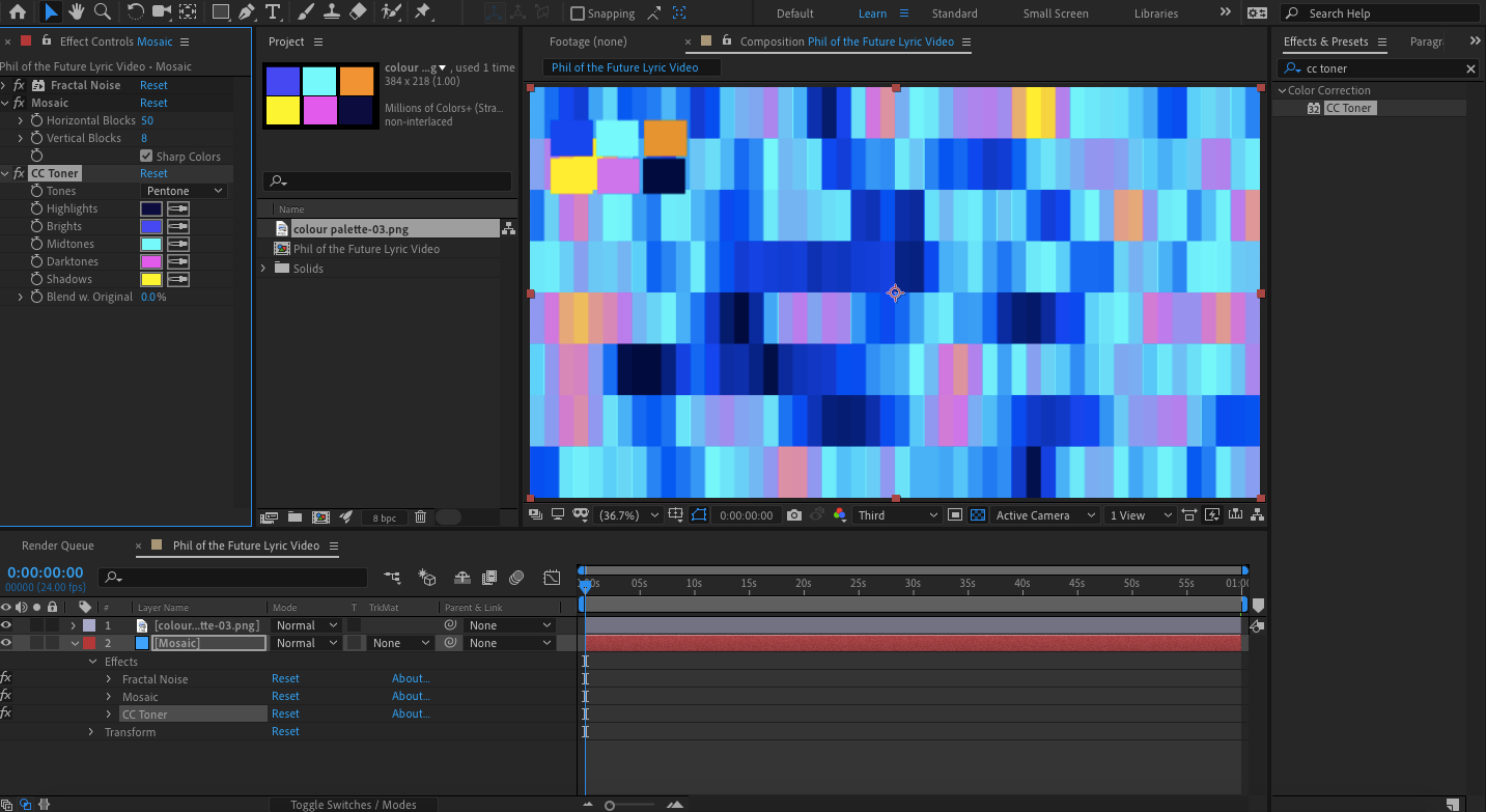
I decided to attempt to make a swirl first, following a tutorial, so I could actually start the creation process, hoping it would direct me in the rest of the process. I chose the colours by sampling the colours that were within the typeface when zoomed in. It gave me a good sense of what the rest of the video was going to look like. I created the first few boards in Illustrator and started animating, as I wanted to make sure my vision was working before I planned the whole video. I continued animating, and also used video tutorials to help me animate some aspects. Towards the end of the process, I had a clear idea of the last few visuals, & just used the storyboard as a loose guide.
During the process, as I played back the video, I made relevant design changes and made sure the timing matched the music. After all of this was triple-checked, I then exported the video and was finished. Over the course of this creation process, I learnt many new skills regarding motion design and how to use After Effects. Though it was a bit challenging at times, I enjoyed doing something different and am proud of my first ever motion design.
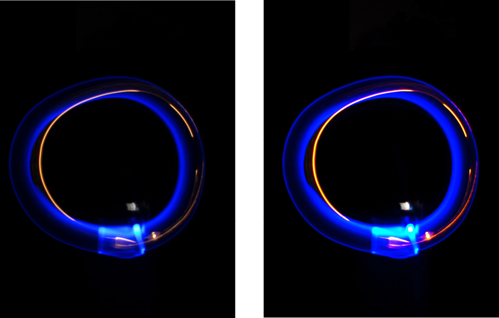
Original ‘O’ (left) vs colour-correct ‘O’ (right).
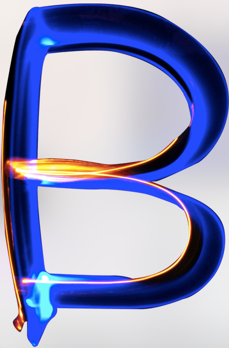
Edited ‘B’ that has been colour-corrected and can sit any background.
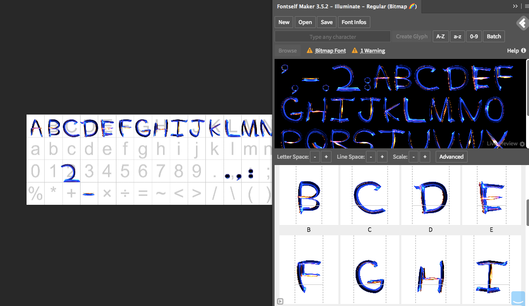
Process of creating typable font in Photoshop
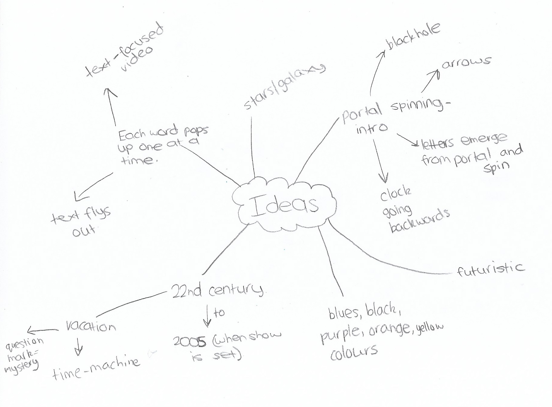
Idea mind map
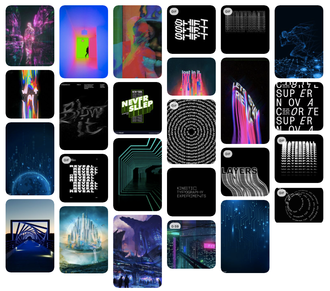
Inspiration Moodboard
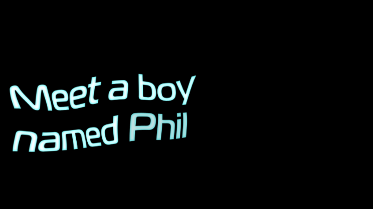
Testing animating lyrics in After Effects following tutorial
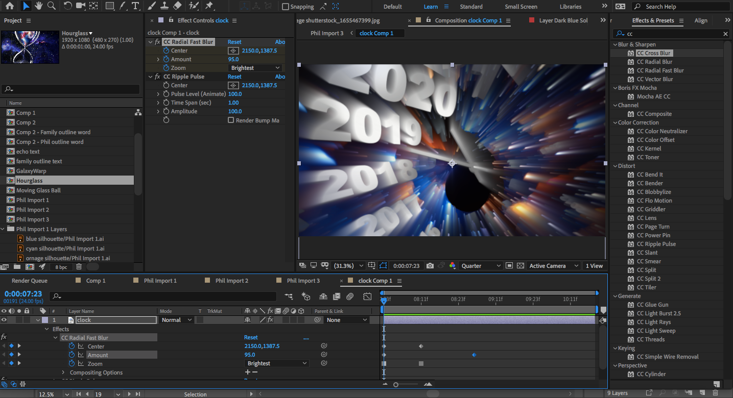
Screenshot of motion design process in After Effects
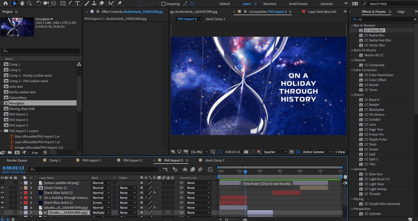
Screenshot of motion design process in After Effects
